
Dose–Response Curves: Graded, Quantal, and How to Read Them
One picture underlies almost every dosing decision in medicine: the dose–response curve. But there are really two curves wearing the same name — one drawn from a single patient whose response grows smoothly with dose, and one drawn from a whole population where each person simply responds or doesn't. Learn to tell them apart, learn to read potency from efficacy at a glance, and the rest of pharmacodynamics falls into place.
In the ICU a patient's blood pressure is dangerously low. The nurse starts a noradrenaline (norepinephrine) infusion and turns the pump up one small step. Nothing dramatic — the arterial line nudges from 55 to 60. Another step: 65. Another: 74. The team keeps climbing, and the number climbs with them — 80, 86, 90 — until, past a certain rate, more drug barely moves it: 91, 92, and it flattens. You have just watched a dose–response curve being drawn in real time on the monitor: a response that rises with dose, then plateaus. Every curve in this chapter is that bedside picture, formalized.
The graded curve: one patient, a response that grows
A graded dose–response curve describes a single individual or tissue. The response it measures is continuous — it can take any value along a scale (a blood pressure, a heart rate, a degree of muscle contraction, a fall in glucose) — and it grows smoothly as the dose grows. Plot response against dose on ordinary (linear) axes and you get a rectangular hyperbola: a steep early rise that bends over and approaches a ceiling. That ceiling is the maximal effect the system can produce.
Now the trick that every textbook uses. We rarely draw the curve on a linear dose axis. Instead we plot response against the LOGARITHM of the dose, and the hyperbola straightens into a graceful sigmoid — an S-shaped curve. Why bother? Because drug doses span enormous ranges (a factor of hundreds or thousands), and a log scale compresses that range so the whole curve fits on one page. More importantly, the log scale spreads out the clinically useful middle of the curve — the 20–80% region — into a near-straight line, which makes it easy to read off doses, compare drugs, and see the midpoint clearly.
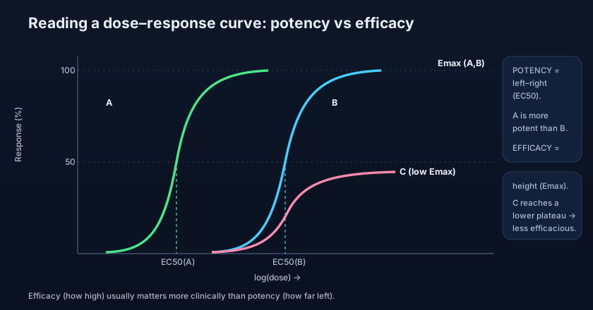
The sigmoid gives us two readouts we will use forever. The height of the plateau is the Emax — the maximum effect the drug can produce no matter how much you add. And the dose (or concentration) that produces half of that maximum is the EC50 — the half-maximal effective concentration, the exact midpoint of the S. Emax tells you HOW BIG an effect is possible; EC50 tells you HOW MUCH drug it takes to get halfway there.
The sigmoid is not a biological miracle — it is what a hyperbola looks like when you stretch the x-axis logarithmically. Same data, prettier ruler. If a question shows you a hyperbola and a sigmoid "for the same drug," they are not two behaviours; they are one behaviour on two axes. Knowing this saves you from over-interpreting the shape.
Reading a curve: potency (left–right) vs efficacy (up–down)
Two curves, two completely different questions. Where a curve sits left-to-right tells you the drug's potency. Potency is captured by the EC50: the further LEFT the curve sits (the smaller the EC50), the less drug you need for a given effect, so the more potent it is. How HIGH the curve rises tells you the drug's efficacy — its Emax, the size of the maximal effect it can deliver. Potency is a horizontal property; efficacy is a vertical one. Reading them off the graph is literally a matter of looking sideways versus looking up.
The crucial insight — the one exams love — is that potency and efficacy are independent. A drug can be more potent yet less efficacious than another, or less potent yet more efficacious. Potency mostly reflects affinity (how tightly the drug binds) plus the tissue; efficacy reflects how good the bound drug is at producing an effect (its intrinsic efficacy). This is exactly the affinity–efficacy–potency triad from the previous chapter, now made visible as the position and height of a curve.
Furosemide (a loop diuretic) and hydrochlorothiazide (a thiazide) show the point clearly. A loop diuretic has a much higher ceiling — it can excrete a far larger fraction of filtered sodium — so its Emax (efficacy) is greater. Comparing opioids makes the same point on potency: fentanyl is enormously more potent than morphine (its curve sits far to the LEFT — micrograms versus milligrams), yet both can reach a similar maximal analgesia. "More potent" (left-shifted) is not "stronger effect" (taller). Confusing the two is a classic error.
- Graded curve = ONE individual/tissue, a CONTINUOUS response that grows with dose.
- Linear dose axis → hyperbola; LOG dose axis → sigmoid (S-shape).
- We use a log axis to compress a huge dose range and straighten the useful middle.
- EC50 = dose for half-maximal effect (potency); Emax = plateau height (efficacy).
- Potency (horizontal, left = more) and efficacy (vertical, higher = more) are INDEPENDENT.
The quantal curve: a population, all-or-none
Now change the question entirely. Some endpoints are not graded at all — they are all-or-none: a patient is either asleep or awake, the seizure either stops or it doesn't, the arrhythmia either converts or it doesn't. You cannot be "40% asleep." To study such endpoints we leave the single patient behind and look at a whole population. For each dose we ask: what PERCENTAGE of the group shows the defined response? That is a quantal dose–response curve.
Plot the cumulative percentage of the population responding against log dose and you again get a sigmoid — but its meaning is different. It is not the growing effect in one person; it is the accumulating fraction of PEOPLE who have crossed the all-or-none threshold as the dose rises. Its midpoint is the ED50: the median EFFECTIVE dose, the dose at which 50% of the population shows the desired response. Because individuals differ in sensitivity, the curve's spread is a direct picture of population variability — a narrow curve means people respond at similar doses; a wide, shallow one means they scatter.
The same population idea measures harm, not just help. Repeat the experiment with a toxic endpoint instead of a therapeutic one and you get the TD50: the median TOXIC dose, at which 50% of the population shows a defined toxic effect. Do it with death as the endpoint in animal studies and you get the LD50: the median LETHAL dose. Lining ED50 up against TD50 (or LD50) is the whole foundation of the therapeutic index — the safety-margin measure we build in the very next chapter.
Give a hypnotic such as a benzodiazepine to a group at increasing doses and record, at each dose, the percentage of subjects who fall asleep (a clean all-or-none endpoint). At low doses almost none sleep; at a middle dose roughly half do — that dose is the ED50 for sleep; at high doses essentially everyone does. Push higher and a second, toxic quantal curve appears — the percentage with respiratory depression — whose ED50 is a TD50. How far apart those two curves sit is exactly what "how safe is this drug" means.
Slope and shape: why steepness matters
The steepness of a curve is not decoration — it is clinical information. A STEEP curve means a small change in dose produces a large change in response (graded) or sweeps most of the population across the threshold over a narrow dose range (quantal). Steep curves demand careful titration: the gap between too little and too much is small. A SHALLOW curve is more forgiving — response changes gradually, so dosing is less knife-edge, but you may also need a wide dose range to move a patient from no effect to full effect. Reading slope alongside position and height completes the picture a single curve can tell you.
- Quantal curve = a POPULATION and an ALL-OR-NONE endpoint (asleep/not, seizure stopped/not).
- It plots cumulative % of the population responding vs log dose.
- ED50 = median effective dose; TD50 = median toxic; LD50 = median lethal (animals).
- Curve spread reflects population VARIABILITY in sensitivity.
- ED50 vs TD50/LD50 sets up the therapeutic index (next chapter).
- Steep curves need careful titration; shallow curves are more forgiving.
- Confusing the two curves: graded = one individual, continuous; quantal = a population, all-or-none. They answer different questions.
- Reading potency when the question asks about efficacy. A left-shifted (more potent) curve is not necessarily a taller (more efficacious) one.
- Forgetting the dose axis is a LOG scale, then misreading distances as if they were linear doses.
- Treating EC50 (graded, half-max effect in one) and ED50 (quantal, 50% of a population respond) as the same number. They are different concepts.
Two full agonists act on the same receptor. Drug A's log dose–response curve lies to the LEFT of Drug B's, but both reach the same plateau. Which statement is correct?
- Graded curve = one individual, continuous response; hyperbola on linear dose, sigmoid on log dose.
- EC50 = potency (horizontal, left = more potent); Emax = efficacy (height of plateau); they are independent.
- Quantal curve = a population, all-or-none; cumulative % responding vs log dose gives ED50, TD50, LD50.
- Quantal curves show population variability and feed straight into the therapeutic index.
- Rang HP, Dale MM, et al. Rang & Dale's Pharmacology — Graded and quantal dose–response relationships; potency and efficacy.
- Katzung BG. Basic & Clinical Pharmacology — Drug receptors & pharmacodynamics: graded vs quantal curves, EC50, Emax, ED50/TD50/LD50.
- Whalen K. Lippincott Illustrated Reviews: Pharmacology — Dose–response relationships, potency vs efficacy.
- Brunton LL, et al. Goodman & Gilman's The Pharmacological Basis of Therapeutics — Quantal dose–effect relationships and the therapeutic index.
- Bertram G. Katzung & Trevor's Pharmacology Examination & Board Review — Concentration–response and dose–response worked concepts.